
Appearance
Graphics & Overlays
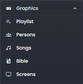
Playout gives you real-time control over the graphics that appear on your live broadcast. Once you open an event, the Graphics section appears in the sidebar.
Playlist (Queue)
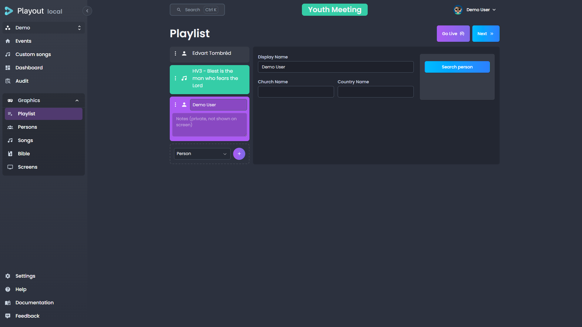
The playlist is your main staging area for items you want to send to the screen. Think of it as a "next up" list.
Adding Items
Add items to the playlist from the Persons, Songs, or Bible tabs. When you find something you want to queue, click the add to playlist action on that item. It will appear in the playlist panel.
Reordering
Drag and drop items in the playlist to change their order.
Sending to Screen
Click on a playlist item to send it to the live screen. The item will be displayed as a lower third or fullscreen overlay depending on its type.
Removing Items
Remove items from the playlist by clicking the remove action on the item.
Clearing the Playlist
To empty the playlist in one go, click Clear playlist at the bottom of the playlist column (the button only appears when the playlist has elements). It removes every element at once and clears the live song selection.
WARNING
Clearing the playlist is permanent and cannot be undone — a confirmation prompt guards the action. It's handy for resetting a finished event's playlist before preparing the next one.
Running the Playlist from the Keyboard
The live controls above the playlist all have a keyboard shortcut, so you can run a service without reaching for the mouse:
| Shortcut | Action |
|---|---|
Ctrl → / Ctrl ↓ | Take the next playlist item on air |
Ctrl ← / Ctrl ↑ | Go back to the previous item |
Alt L | Go live with the selected item, or stop it |
Alt B | Show or hide the playlist banner |
Alt P | Pause or resume the live item's countdown |
Alt T | Show or hide the selected item's lowerthird |
Next and Previous step relative to what is currently on air, not to the row you have selected — so they keep working after you click around the playlist to check something. With nothing on air, Next starts the playlist at its first item.
TIP
Every shortcut is customizable per tenant, and each button's tooltip shows its current key. Shortcuts never fire while you are typing in a field, and a shortcut can only do what its button could — it won't go live with nothing selected, or step past the end of the playlist.
Saving a Song to Custom Songs
When a song is in the playlist and is not live, a Save as custom song button appears below the song editor. Click it to save a copy of the song to your tenant's custom songs library. A success notification confirms the action.
TIP
This is useful for keeping a local copy of a shared song that you've customized with comments or structural changes.
Element Timer
Any playlist element can carry a timer — an allotted amount of time that counts down on a dedicated screen, so a speaker on stage can see how long they have left.
Setting a Duration
Select a playlist element. A Timer field appears with it in the playlist (next to its notes), where you type the duration as M:SS — for example 5:30. You can also enter a plain number of seconds (90 becomes 1:30). Leave it empty for no timer; clearing the field removes the timer. The duration saves automatically, like the element's name and notes.
How the Countdown Works
The countdown starts the moment you send the element live (Go Live), anchored to the server clock — so every screen agrees on the time remaining and it stays accurate even if a screen reloads. Re-sending the same element live restarts its timer.
When an element with a timer is live, a Pause / Resume button appears next to Go Live. Pausing freezes the countdown; resuming continues from exactly where it stopped.
A discreet countdown also shows on the live element in the playlist itself, so you can keep an eye on the time without a dedicated screen — green while counting down, grey when paused, and red once it runs into overtime.
Showing the Timer on a Screen
To display the countdown, add a Component source set to Element timer to a screen's scene (see Screens). It shows a large countdown that:
- counts down from the live element's duration,
- turns red and gently pulses when it reaches zero (without strobing — and it honours reduce motion system settings),
- then counts up in overtime (e.g.
+0:45) so the speaker sees how far past their time they've run.
TIP
This is meant for a confidence monitor or stand screen the speaker can see — not the broadcast output.
Persons (Lower Thirds)
The Persons tab lets you search for people and display their name as a lower-third overlay on the broadcast.
Searching for a Person
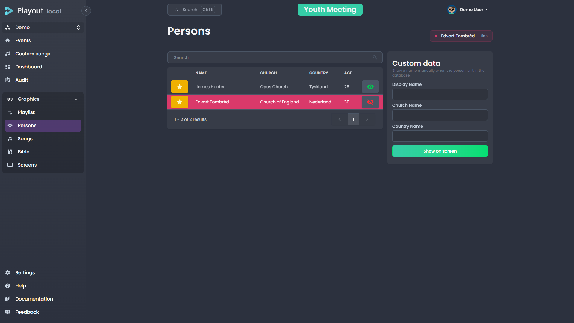
Use the search bar at the top to find a person by name, church, country, or person ID. Results appear instantly as you type and load progressively as you scroll down.
Displaying a Lower Third
Click on a person in the search results to send their name to the screen as a lower third. The overlay will appear using the duration configured in your tenant settings.
Person Details
Each search result shows:
- Display name
- Title (optional)
- Church
- Country
Lower Third Layout
When a person is sent to screen, the lower third displays:
- Header — the person's display name
- Body — the person's title (if set), followed by church and country separated by a dot (e.g. "Oslo · Norway")
Church & Country Visibility
By default, both church and country are shown on person lower thirds. You can control the starting default in Settings → Lowerthird using the Show church and Show country toggles.
On the Persons page, the On air / Hidden pills — in the table's church and country column headers, and next to the fields in the custom person editor — set the visibility for everything you send from that page during the session.
Playlist person elements use the same pills, but the choice is saved on the element itself: a new element starts from the Persons page's current setting, and once you flip a pill on an element it keeps its own value — independent of the Persons page and of other elements.
TIP
If your tenant has sharing links set up, you can also search people from shared tenants.
Songs
The Songs tab provides full control over song lyrics during a broadcast.
Selecting a Song
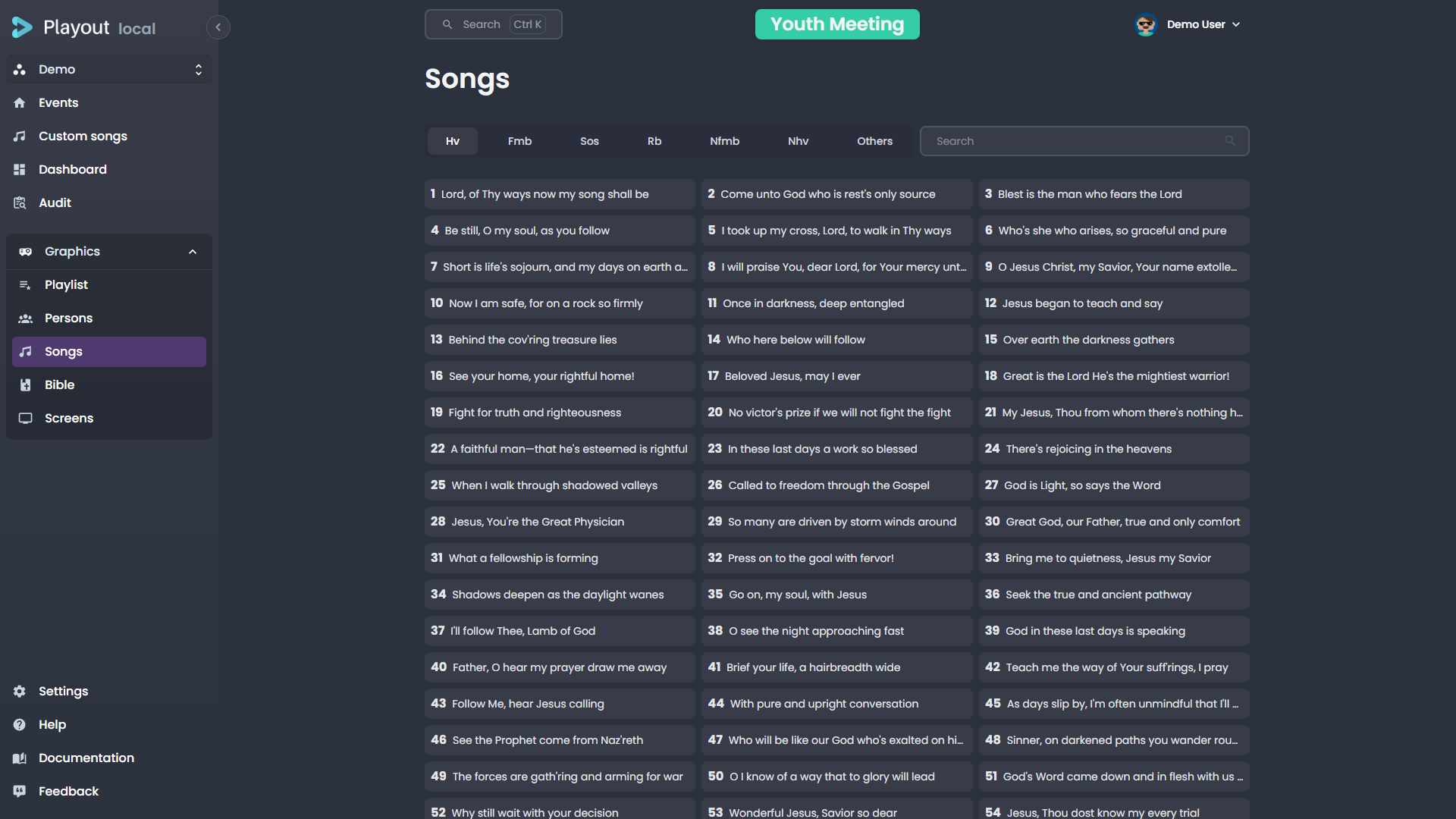
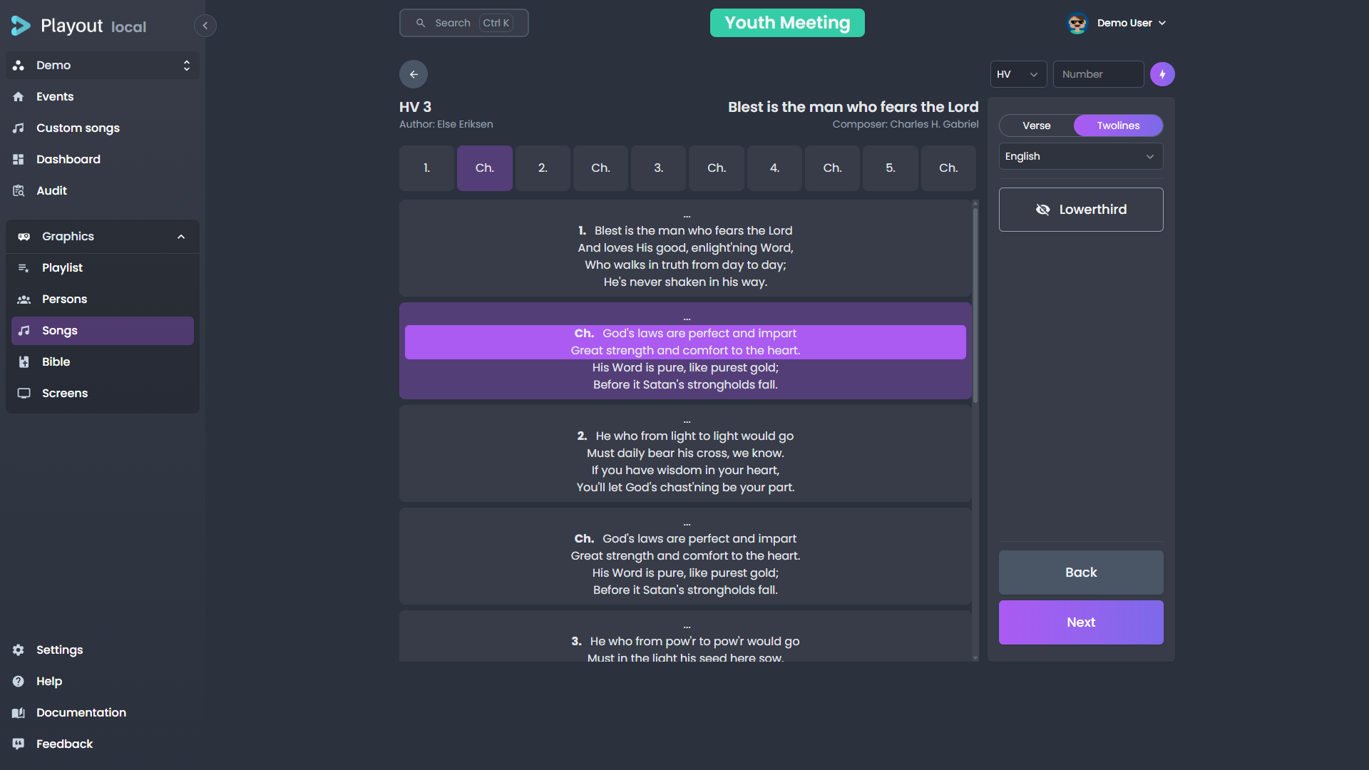
Search for a song by title, number, or author. Click a song to open its verse navigator.
Navigating Verses
Once a song is selected, its structure (verses, choruses, bridges) is displayed. Click on any section to send it to the screen.
Display Modes
The display mode controls what happens when you press the next action. The tenant default lives in Settings; during an event, flip the Subtitles checkbox on the song control:
| Mode | "Next" behavior |
|---|---|
| Verse | Advances to the next verse (or chorus, bridge, etc.) in the song structure |
| Subtitles | Advances to the next group of lines within the current verse |
Karaoke Lines per Page
The subtitle strip always shows 2 lines. The Lines per page setting only sizes the karaoke screen's window — how many lines reveal together there (2–5) while the operator still steps two lines at a time. Set the tenant default in Settings → Looks (Tenant default, Karaoke tab), or change it live from the song control's Karaoke panel.
Single Verse Mode
Enable Single verse to display only the current verse on the fullscreen lyrics view, instead of grouping multiple verses per page. This is useful for songs with long verses or when you want the audience to focus on one section at a time.
Single verse mode can be toggled in Settings → General or live from the song control panel using the Single verse checkbox.
Karaoke Speed
The karaoke lyrics overlay reveals characters one at a time. If a song feels too fast or too slow for the audience to follow, adjust the reveal speed:
- Tenant default — Set the default pacing in Settings → Looks: with Tenant default selected, the Karaoke tab holds Reveal pacing — the same seconds-per-line slider and live preview the operator sees.
- Per song — Open the Karaoke panel on the song control during a live event and drag Line reveal time. The override applies for this event only; Reset to default falls back to the tenant setting.
The slider is expressed in seconds until an average line of the current song has fully revealed, so the same setting adapts to short and long lines. The + / - keys nudge the speed live without opening the panel.
TIP
The karaoke reveal speed only changes on the next verse advance — adjusting the speed while a verse is mid-reveal lets the current verse finish at its existing speed.
Two Operators: Drive Karaoke Only
When one operator runs the congregation screens and another runs the karaoke screen, the second operator opens the Karaoke panel and enables Drive karaoke only. Their next/previous keys (and line clicks) then move only the karaoke subtitle line, while the main screens keep following the first operator's shared position. The switch is per-browser and resets on reload, so each operator controls their own mode.
Styling for This Event
An event's look is picked in Edit event on the dashboard, under Styling, and is named on the dashboard card beside the location. Use that when you just want to change which look the event follows.
Styling… at the bottom of the Karaoke panel opens the per-event styling dialog, which does the same thing and lets you tweak on top. Pick a look (or the tenant default) — the look applies to the whole event — then adjust the karaoke typography and shadow for this event only. Changes apply live on screen. Overriding the look shows when tweaks are active; Reset to look clears them. Tenant-wide font imports stay in Settings.
Side Banner
The fullscreen lyrics can show the songbook banner beside the text. The tenant default lives in Settings → Overlay (Show side banner); an operator can override it for the current event with the Show side banner checkbox on the song control — useful when a special event wants edge-to-edge lyrics. The override indicator offers Reset to default to fall back to the tenant setting.
Song Comments
Comments let musicians and operators add notes to individual lines within a song — tempo cues, dynamics, repeat instructions, or any other annotation your team needs.
Adding Comments
Open a song for editing (via Custom Songs or from the song search). In the lyrics view:
- Click a line to select it, or Shift-click to select a range of consecutive lines.
- A comment toolbar appears below the verse. Type your note, pick a color, and toggle bold or italic as needed.
- Comments save automatically as you type — no save button required.
TIP
You can add a color or style without any text. This is useful for marking sections visually (e.g., a green highlight for "louder" or red for "slow down").
Repeated Verses
If a chorus or other section appears multiple times in the song structure, each occurrence can have its own comments. A note on the first chorus does not affect the second.
Comments During Playback
During a live event, comments are visible in two places:
- Song control panel — a small colored dot appears next to lines that have comments. Hover to read the note.
- Musician view — comments display alongside the lyrics with the chosen color, style, and text. The background color is brighter on the active line and faded on inactive lines.
Removing Comments
Select the commented lines and click Delete comment in the toolbar.
Clearing the Screen
Click the active verse again or use the clear action to remove the song overlay from the screen.
You can also press Next past the final verse in both Verse and Subtitles modes. The screen advances to a trailing empty step which clears the lyrics from the broadcast — useful at the end of a song when you want the karaoke or fullscreen text to fade out instead of cutting.
Bible
The Bible tab lets you display Bible verses as overlays.
Selecting a Verse
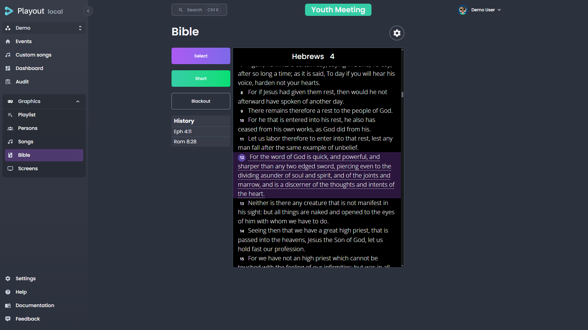
- Choose a book from the dropdown (or search)
- Select the chapter
- Enter the verse number
Click the "Short" action to display the verse on screen.
Navigating Verses
Once a verse is displayed, a preview of the text appears. You can navigate directly to a different verse by clicking on its verse number in the preview.
Multiple Versions
If your tenant has multiple Bible versions configured (see Settings), you can switch between them using the settings gear.
Screens
The Screens tab is available to admins only. It controls the configuration of your overlay output screens.
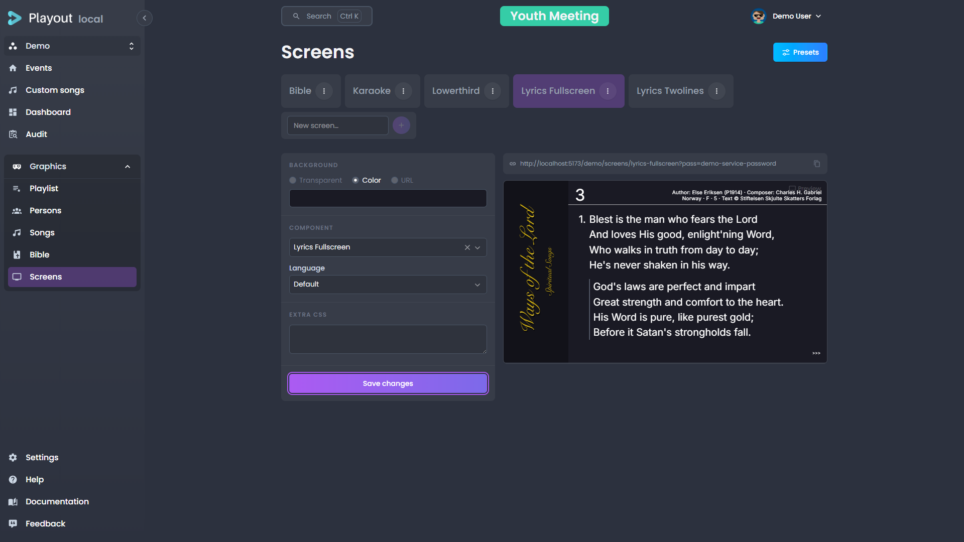
Every screen is a scene: a 1920×1080 canvas holding a stack of positioned sources. The editor has a sidebar on the left — the screen selector on top, then the screen's sources and the selected source's settings — and the canvas on the right. Transparent areas of the canvas show as a checkerboard; on the live output they are truly transparent, ready to be layered over video.
Picking and Managing Screens
The dropdown at the top of the sidebar switches between screens — it also shows how many sources the current screen has. Inside it, each screen row has rename and delete actions, and Add screen at the bottom creates a new one.
While the event is on air, each screen also carries a status dot — green when its output is open and visible, amber when its window is hidden or covered, red when it has stopped responding — so you can see from here that the projector is actually up. See Screen health.
Below the selector, the screen's URL row copies the link, opens it in a tab, or — in Chrome and Edge — opens it on a display of your choice as a standalone window that offers to go fullscreen there. See Displays and kiosks.
A screen's name becomes its id — the last segment of its screen URL — with spaces turned into dashes, so screen names have to be unique. If the name you type resolves to an id that already exists, Playout refuses it rather than replacing the existing screen; pick a different name. Renaming works the same way.
Deleting a screen asks for confirmation and names it: its sources, background and custom CSS are removed permanently, and anything currently rendering its URL (an OBS browser source, a projector) goes blank. Templates that contain the screen are not changed.
Sources
+ Add source at the bottom of the sidebar adds a source of one of these types:
| Type | Description |
|---|---|
| Component | A Playout view — lower third, program, lyrics, Bible, the Element timer (speaker countdown) — or any custom overlay. Each component source has its own Language, Bible version and per-source Extra CSS; a lower third also picks which kinds it shows |
| Existing screen | Another screen rendered inside this one — build a screen once, reuse it everywhere. Circular references are blocked |
| Web | Any web page by URL |
| Text | A text block with font size, weight, color and alignment |
| Image | An image by URL, with contain/cover/fill fit |
| Rectangle | A colored box, optionally rounded |
| QR code | A QR code for any value |
| Timer | A countdown, count-up or clock, synchronized across every screen showing it |
A component source behaves like a mini screen: the component renders at the full 1920×1080 canvas and is scaled to fit its box (aspect preserved), so text and layout shrink with the box instead of reflowing.
The Sources list stacks the scene top-first: drag a card by its handle to restack, or use the card's menu to move it one step. Each card also toggles visibility (the eye), duplicates the source, or deletes it.
Selecting a source — in the list or by clicking it on the canvas — opens the Selected panel with its content settings, its transform (position and size as percentages of the canvas, an aspect-ratio lock, and an align-in-frame grid) and its appearance (opacity, layer order, per-source CSS). On the canvas itself, drag a source to move it, use the corner handles to resize, or nudge it with the arrow keys (1%, or 5% with Shift held).
The toolbar above the canvas zooms the stage (Fit returns to the full view), and toggles the grid, broadcast safe areas (action and title safe), and snap — which aligns movement to the grid and the canvas center.
Choosing Which Lower Thirds a Layer Shows
A lower third component source carries a Show which lower thirds group of checkboxes — Person, Song, Bible verse and Info. Unticked kinds are ignored by that layer: they still go on air everywhere else, they just never appear on this one.
This lets one screen carry a different subset than another. A stream output can take all four, while a stage-facing screen shows only Person — so speaker names reach the stage without song credits or Bible verses cluttering it. Two layers on the same screen can also split the kinds and be positioned independently: person names low-left, song credits low-right.
All four ticked is the default and means "no filter" — including any new kind added to Playout later. Existing screens are unaffected: they keep showing everything until you narrow them.
WARNING
Unticking every box leaves the layer permanently empty. The editor flags this, since it is almost always a mis-click.
Screen Settings and Extra CSS
Screen settings above the source list holds the screen-level options: the background (transparent, a color, or an image URL) and the screen's Extra CSS.
Extra CSS lets you restyle what a screen shows — resize the lyrics, recolor the lower third, move the program strip — without touching the components themselves. The CSS applies globally on that screen's output, so keep selectors specific. (Component sources additionally take per-source CSS in the Selected panel, scoped to just that source.)
The magic-wand button — next to the Settings trigger for screen-level CSS, and in the Selected panel's Extra CSS header for per-source CSS — opens Generate CSS with AI: describe the styling in plain language — "make the lyrics background red, and center them" — and review the result, then Apply to put it in the field (or Discard and reword). AI sees the rendered scene (and, for a component source, that component's actual selectors), so it targets the right elements.
Saving
Nothing changes on the live output until you click Save at the bottom of the sidebar — unlike the overlay editor, this page does not auto-save. If you pick a different screen while there are unsaved edits, Playout asks before discarding them.
Legacy Screens
Screens created before the scene editor show a notice instead of the source list: they still render on the live output exactly as before, but editing them means clicking Convert to scene, which wraps their component into a full-canvas source. The conversion is one-way and takes effect when you save.
Templates
Your screen layouts are saved and reused as part of an event template (called a preset until v2.5). A template bundles the screen configuration together with the event's other shared settings (look, location, streaming rules, and more), so applying one sets up a whole event at once.
Templates are captured and applied from the template menu at the top of this page. See Event Templates for how to save, apply, and override them, and Settings → Presets to review what each template carries.
TIP
When creating an event, you can select a template to automatically configure the screens — and the rest of the shared settings — when the event starts.
Custom Overlays
INFO
The Custom Overlays feature requires the Components feature flag to be enabled in Settings.
Custom overlays are graphics you design once and reuse — a lower third, a caption, a sponsor bar — built from a simple HTML template with placeholders for the parts that change. They let you go beyond the built-in person, song, and Bible overlays.

The Editor at a Glance
The page is a three-column workspace:
- The overlay list (left) — every overlay in your tenant, with a search box and an Add field at the bottom. Each card shows the overlay's render mode, and a green dot marks one that is currently on screen; the selected card carries duplicate and delete actions inline.
- The editor (center) — the overlay's name, its render mode (HTML / Lottie / Rive), and three tabs:
| Tab | What it's for |
|---|---|
| Preview | A live preview of the overlay at 1920 × 1080, on a checkerboard so transparent areas read clearly, with toolbar toggles for a grid, broadcast safe areas and snap. |
| Data | Sample values that fill your template's placeholders so you can see the design with realistic content while you build it. They are saved with the overlay and only ever used by the Preview — what actually goes to air is the data on the playlist item, see Filling in Data and Going Live. |
| Template | The HTML template itself. |
| Lottie | Upload a Lottie animation and map its text layers to data fields. Shown when the render mode is Lottie — see Lottie Animations. |
| Rive | Upload a Rive animation, pick its state machine, and map its text runs to data fields. Shown when the render mode is Rive — see Rive Animations. |
- The settings panel (right) — the overlay's Position & size, Behavior (auto-hide and show/hide animation), Animated background, and Custom styling sections, with Duplicate and Delete at the bottom.
A few things apply everywhere:
- Auto-save — Edits save on their own as you work. A quiet Saving… / Saved indicator sits next to the name; there is no Save button.
- Rename — Edit the name field at the top of the editor.
- Show on screen — The live Show on screen / Hide from screen button sits in the page header, always in the same place. This is the only action that affects the broadcast.
- Delete — In the settings panel (and on the selected list card). It asks you to confirm first, naming the overlay and listing any screens that currently select it — those screens render nothing until you pick another overlay for them.
Positioning & Size
By default an overlay fills the whole 1920 × 1080 screen, and where things sit is decided by the design (your HTML/CSS, or the Lottie/Rive file). The Position & size section — together with the Preview — places and scales the overlay directly, the same way for all render modes:
- Drag the overlay in the preview to move it, or nudge with the arrow keys (1%, or 5% with Shift). The snap toggle aligns dragging to the grid.
- Position X / Y — the offset as a percentage of the screen.
- Scale — the slider resizes the whole overlay, growing or shrinking from the chosen anchor.
- Anchor — the 3 × 3 grid sets the point the overlay scales from and is positioned against (e.g. anchor bottom-left for a lower third).
- Reset to full screen — clears the placement so the overlay fills the screen again.
Placement is part of the overlay's design (saved on the template, shared across events), so it's a property of the overlay itself, not a per-event value.
Creating an Overlay
You have three starting points:
- Generate with AI — Describe the overlay you want in plain language and AI builds a complete starting point: the template, its data fields, styling, and an animation. See Generating and Refining with AI.
- New from template — Opens a gallery of ready-made overlays. Pick one to clone, then edit its text and colours. The Animated lower third (Lottie) starter comes with a working sample animation, so it plays immediately — use Replace file on its Lottie tab to swap in your own.
- Start blank — Type a name in the Add field (or use Start blank from the empty state) to create an empty overlay. A new overlay opens straight to the Template tab so you can start writing.
Generating and Refining with AI
Generate with AI (in the page header and the empty state) opens a dialog where you describe the overlay you want — for example, "a lower third for a guest speaker — dark glassy bar, gold accent". AI returns a complete draft: a named overlay with a Mustache template, typed data fields, styling, an enter/leave animation, and sample data so the preview renders immediately. The draft lands in the normal editor, where you refine it like any other overlay.
With an overlay selected, Refine with AI (next to Show on screen) does the same for the existing overlay: describe the change — "make the bar narrower and right-aligned" — and AI updates the template and styling in place, keeping field names where it can so your data isn't orphaned.
Review before going live
AI output is a starting point, not a finished product. Check the template, fields, and styling in the preview before you Show on screen. If you see "Too many requests", wait a moment and try again.
Writing a Template
A template is plain HTML. Wherever you want a value that changes between uses, insert a placeholder with double curly braces:
html
<div class="lower-third">
  <h1>{{name}}</h1>
  <p>{{role}}</p>
</div>
Each placeholder automatically becomes a field on the Data tab — here, a name field and a role field.
To repeat a block (for example, a list of sponsors), wrap it in a section:
html
<ul>
  {{#sponsors}}
    <li>{{company}}</li>
  {{/sponsors}}
</ul>
This creates a repeating sponsors list on the Data tab, where each item has a company field. Add as many items as you need.
TIP
Placeholders and sections use Mustache syntax. You only need {{value}} for a single value and {{#list}}…{{/list}} for a repeating section — that covers almost every overlay.
Controlling Field Types
By default every placeholder becomes a plain text box on the Data tab. To get a better editor — a colour picker, a date picker, a dropdown — declare the field's type with a hint comment at the top of your template:
html
{{! @field accent: color }}
{{! @field starts: date }}
{{! @field size: select, small, medium, large }}
The hint format is {{! @field <name>: <type> }}. Supported types:
| Type | Editor shown on the Data tab |
|---|---|
text | Single-line text box (the default) |
textarea | Multi-line text box |
number | Number input |
email | Email input |
color | Colour picker |
date | Date picker |
select | Dropdown — list the options after the type, comma-separated (e.g. select, small, medium, large) |
boolean | On/off toggle |
image | Text box for an image URL |
To type a field inside a repeating section, use a dotted path — the section name, then the subfield:
html
{{! @field sponsors.logo: image }}
{{#sponsors}}
  <img :src="{{logo}}">
{{/sponsors}}
TIP
An unknown or misspelled type is simply ignored, and the field falls back to a plain text box — your overlay never breaks because of a hint.
Filling in Data and Going Live
An overlay is a tenant-level template, and the values that fill it belong to the event you are producing. So you fill them in and push the overlay on air from the playlist, not from this editor:
- In the event's playlist, add a custom overlay item and pick this overlay by name.
- Fill in the fields on the item. Each placeholder in the template is a field here, and the values are stored on that playlist item — so the same overlay can carry different text in two events, or twice in one service.
- Click Show on screen on the item to push it to the broadcast. The button changes to Hide from screen while it's live, and the overlay's dot turns green.
The editor itself is where you design the template and see it in Preview. Its Data tab holds sample values — so you can check a design against realistic content without an event — and those are saved with the overlay and used only by the Preview. Opened from inside an event, the Data tab edits that event's values instead and the on-air buttons appear; from the workspace (Custom overlays in the menu) there are no on-air buttons, so nothing you type there can reach a broadcast by surprise.
TIP
Starters from New from template and overlays generated with AI arrive with their sample values already filled in, so the Preview shows a finished-looking overlay from the moment you create one.
Lottie Animations
Instead of an HTML template, an overlay can be a Lottie animation — a lightweight, scalable motion graphic. Set Render mode to Lottie file at the top of the editor, and a Lottie tab replaces the Template tab.
Uploading an Animation
On the Lottie tab, upload a .json or .lottie file. A short upload progress note appears, and once it finishes you can Replace the file or Remove it to start over. The animation then drives the overlay directly — the Preview tab plays it just like an HTML overlay.
TIP
Both formats work: a raw Lottie .json export, or a .lottie bundle (dotLottie). Use whichever your design tool produces.
Binding Text to Data Fields
If your animation has named text layers, they appear under Text bindings after upload. Map each layer to a data field name, and that field shows up on the Data tab — so you fill its text per event without touching the animation.
For example, bind a name text layer to a name field, and you can reuse one animated lower third for every speaker: just type a different name on the Data tab each time. Leave a layer's field blank to leave it unbound, so the animation keeps the text it was designed with.
If the file has no text layers, a short note says so. The overlay still works — it just plays as a fixed animation with nothing to fill in.
Show & Hide Animation (the out Marker)
How the animation plays with Show on screen / Hide from screen depends on the file:
- No markers — the animation plays once from the start when shown and holds its final frame until you hide it. Design the file so its last frame is the on-screen "resting" look.
- With a marker named
out— the broadcast lower-third convention. On Show, the animation plays from the start and holds at the marker (your intro, ending in the resting pose). On Hide, the segment after the marker plays as the exit — the overlay animates off screen before it goes.
Markers are set in your design tool (in After Effects, a composition marker named out at the frame where the exit begins). The bundled Animated lower third (Lottie) starter uses this convention, so it's also a working reference file.
Animated Backgrounds
When Render mode is HTML template, you can also place a Lottie animation behind your HTML. Open the Advanced section and upload a file under Animated background (Lottie). It loops continuously behind the overlay's HTML, so your text and graphics sit on top of live motion. The upload works exactly like the Lottie tab — .json or .lottie, with replace and remove controls.
Rive Animations
Beta
Rive support is in beta. The core flow — upload, bind text, show on screen — works, but expect rough edges.
Rive is an alternative motion-graphics engine to Lottie, with state-machine-driven playback and crisp runtime text. An overlay can be a Rive animation instead of an HTML template or a Lottie file. Set Render mode to Rive file at the top of the editor, and a Rive tab replaces the Template tab.
Uploading an Animation
On the Rive tab, upload a .riv file. As with Lottie, a progress note appears, and once it finishes you can Replace or Remove the file. The animation then drives the overlay directly, and the Preview tab plays it.
Artboard
A single .riv file can hold several artboards — separate designs in one file, such as a lower-third strip and a full-screen slide. The overlay renders exactly one. When your file has more than one artboard, an Artboard dropdown appears; pick the one this overlay should show. Files with a single artboard use it automatically, and the dropdown stays hidden.
Because state machines belong to a specific artboard, the State machine list updates to match the artboard you pick — so changing the artboard clears the current state-machine choice and you re-pick from that artboard's machines.
State Machine
If your Rive file defines one or more state machines, pick which one drives the overlay from the State machine dropdown. The renderer plays it to animate the overlay in and out when you show or hide it. If the file has no state machine, the overlay simply plays its default timeline.
Binding Text
Rive overlays reuse one design per person by mapping data fields to the file's editable text slots. These come from your Rive file's data binding — the string properties on its View Model. They're discovered automatically: after upload, each one is listed under Text bindings, and you type the data field name to bind it to. That field then appears on the Data tab, so you fill its text per event without touching the animation.
For example, a file with firstName and lastName string properties lets you bind each to a data field and reuse one animated lower third for every speaker.
If no bindable text is found, a short note says so — add string properties to your file's data binding in the Rive editor (and bind them to the text in your design) to make text fillable per event. The overlay still works without them; it just plays as authored.
Animations
The Behavior section of the settings panel controls how the overlay appears and disappears:
- Show & hide animation — one choice drives both directions. Pick from presets such as fade, slide, and scale.
- The preview replays the animation whenever you show or hide the overlay, so you can check how it looks without going on air.
For full control, set the animation to Custom (CSS) and define your own keyframes and transition classes in the Custom styling section. Target these class names:
.custom-enter-active,.custom-enter-from— the entrance.custom-leave-active,.custom-leave-to— the exit
The magic-wand button in the Custom styling section opens Generate CSS with AI, which writes the CSS for you: describe the styling you want in words, click Generate, and review the result in the preview box. Apply replaces the editor's contents with the generated stylesheet (your existing CSS is taken into account — describe a change and the result carries the rest over); Discard throws it away, keeping your prompt so you can reword and generate again. AI sees your overlay's template, so it targets your actual class names.
INFO
The Custom styling CSS is not just for animations — it's the overlay's own stylesheet, applied whenever the overlay renders. Use it for keyframes or any styling your template needs.
A Worked Example
A simple sponsor bar that cycles through a list:
html
{{! @field accent: color }}
{{! @field sponsors.logo: image }}
<div class="sponsor-bar" style="border-color: {{accent}}">
  <span class="label">With thanks to</span>
  {{#sponsors}}
    <img class="logo" src="{{logo}}" alt="{{company}}">
  {{/sponsors}}
</div>
On the Data tab you'd get a colour picker for accent and a repeating sponsors list, each item with an image-URL logo and a text company. Fill them in, watch the Preview, pick an enter/leave animation under Advanced, then Show on screen when you're ready.